class: center, middle, inverse, title-slide # Data Visualization with ggplot2 ## EPSY 887 - Fall 2019 ### Jason Bryer, Ph.D. ### University at Albany ### 2019-09-12 --- # Gammar of Graphics with ggplot2 * `ggplot2` is an R package that provides an alternative framework based upon Wilkinson’s (2005) Grammar of Graphics. * `ggplot2` is, in general, more flexible for creating "prettier" and complex plots. * Works by creating layers of different types of objects/geometries (i.e. bars, points, lines, polygons, etc.) `ggplot2` has at least three ways of creating plots: 1. `qplot` 2. `ggplot(...) + geom_XXX(...) + ...` 3. `ggplot(...) + layer(...)` * We will focus only on the second. --- # Parts of a ggplot2 Statement >- Data `ggplot(myDataFrame, aes(x=x, y=y))` >- Layers `geom_point()`, `geom_histogram()` >- Facets `facet_wrap(~ cut)`, `facet_grid(~ cut)` >- Scales `scale_y_log10()` >- Other options `ggtitle('my title')`, `ylim(c(0, 10000))`, `xlab('x-axis label')` --- # Lots of geoms ```r ls('package:ggplot2')[grep('geom_', ls('package:ggplot2'))] ``` ``` ## [1] "geom_abline" "geom_area" "geom_bar" ## [4] "geom_bin2d" "geom_blank" "geom_boxplot" ## [7] "geom_col" "geom_contour" "geom_count" ## [10] "geom_crossbar" "geom_curve" "geom_density" ## [13] "geom_density_2d" "geom_density2d" "geom_dotplot" ## [16] "geom_errorbar" "geom_errorbarh" "geom_freqpoly" ## [19] "geom_hex" "geom_histogram" "geom_hline" ## [22] "geom_jitter" "geom_label" "geom_line" ## [25] "geom_linerange" "geom_map" "geom_path" ## [28] "geom_point" "geom_pointrange" "geom_polygon" ## [31] "geom_qq" "geom_qq_line" "geom_quantile" ## [34] "geom_raster" "geom_rect" "geom_ribbon" ## [37] "geom_rug" "geom_segment" "geom_sf" ## [40] "geom_sf_label" "geom_sf_text" "geom_smooth" ## [43] "geom_spoke" "geom_step" "geom_text" ## [46] "geom_tile" "geom_violin" "geom_vline" ## [49] "update_geom_defaults" ``` --- class: center # .left[Graphing Components: Symbols] 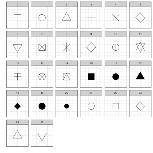<!-- --> --- class: middle, center # .left[Graphing Components: Line Types] 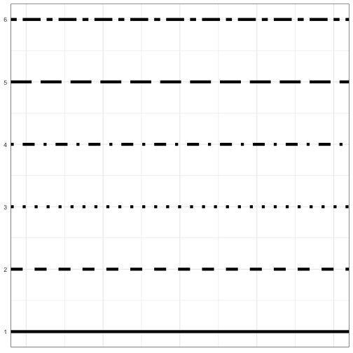<!-- --> --- class: middle, center # .left[Graphing Components: Colors] 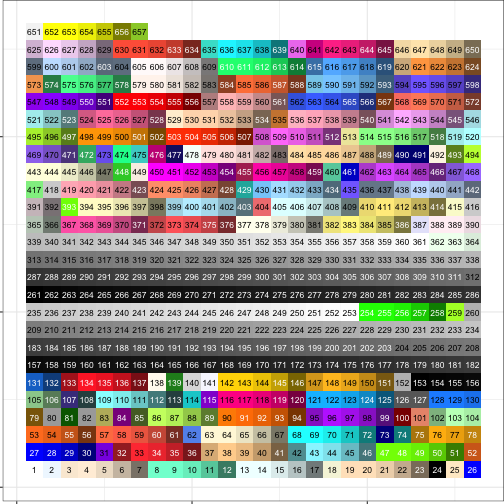<!-- --> --- class: middle, center # .left[Graphing Components: Colors] .pull-left[ 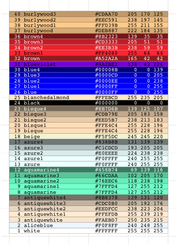<!-- --> ] .pull-right[ 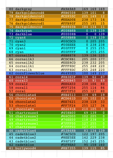<!-- --> ] --- class: middle, center # .left[Graphing Components: Colors] .pull-left[ 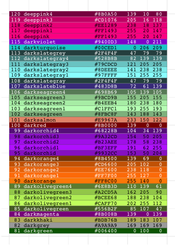<!-- --> ] .pull-right[ 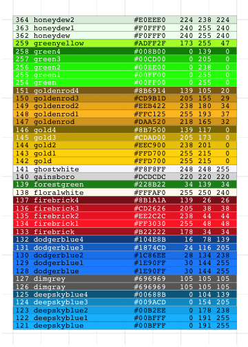<!-- --> ] --- class: middle, center # .left[Graphing Components: Colors] .pull-left[ 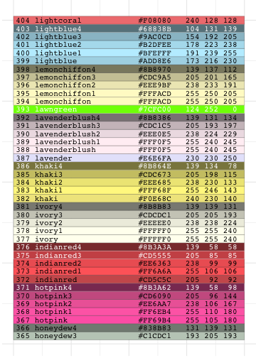<!-- --> ] .pull-right[ 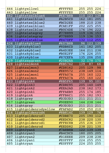<!-- --> ] --- class: middle, center # .left[Graphing Components: Colors] .pull-left[ 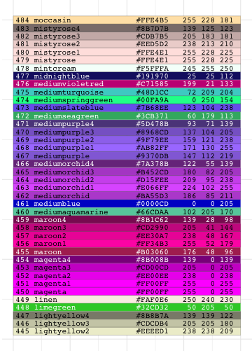<!-- --> ] .pull-right[ 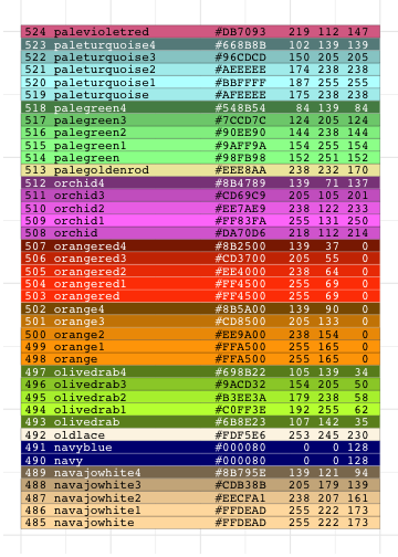<!-- --> ] --- class: middle, center # .left[Graphing Components: Colors] .pull-left[ 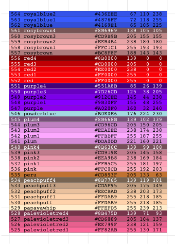<!-- --> ] .pull-right[ <!-- --> ] --- class: middle, center # .left[Graphing Components: Colors] .pull-left[ <!-- --> ] .pull-right[ <!-- --> ] --- # Tutoring Data ```r data(tutoring, package='TriMatch') str(tutoring) ``` ``` ## 'data.frame': 1142 obs. of 17 variables: ## $ treat : Factor w/ 3 levels "Control","Treat1",..: 1 1 1 1 1 2 1 1 1 1 ... ## $ Course : chr "ENG*201" "ENG*201" "ENG*201" "ENG*201" ... ## $ Grade : int 4 4 4 4 4 3 4 3 0 4 ... ## $ Gender : Factor w/ 2 levels "FEMALE","MALE": 1 1 1 1 1 1 1 1 1 1 ... ## $ Ethnicity : Factor w/ 3 levels "Black","Other",..: 2 3 3 3 3 3 3 3 1 3 ... ## $ Military : logi FALSE FALSE FALSE FALSE FALSE FALSE ... ## $ ESL : logi FALSE FALSE FALSE FALSE FALSE FALSE ... ## $ EdMother : int 3 5 1 3 2 3 4 4 3 6 ... ## $ EdFather : int 6 6 1 5 2 3 4 4 2 6 ... ## $ Age : num 48 49 53 52 47 53 54 54 59 40 ... ## $ Employment: int 3 3 1 3 1 3 3 3 1 3 ... ## $ Income : num 9 9 5 5 5 9 6 6 1 8 ... ## $ Transfer : num 24 25 39 48 23 ... ## $ GPA : num 3 2.72 2.71 4 3.5 3.55 3.57 3.57 3.43 2.81 ... ## $ GradeCode : chr "A" "A" "A" "A" ... ## $ Level : Factor w/ 2 levels "Lower","Upper": 1 1 1 1 1 2 1 1 1 1 ... ## $ ID : int 377 882 292 215 252 265 1016 282 39 911 ... ``` --- # Histogram -- ```r ggplot(tutoring, aes(x = Age)) + geom_histogram() ``` 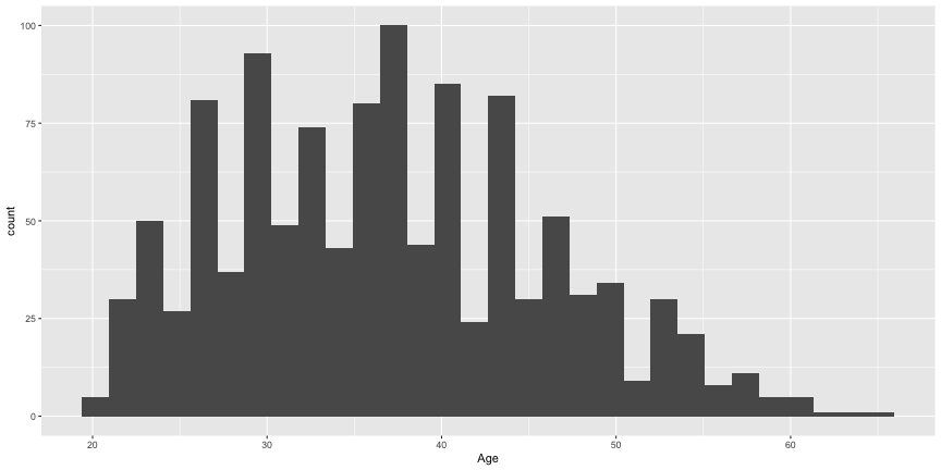<!-- --> --- # Histogram (add in qualitative variable) -- ```r ggplot(tutoring, aes(x = Age, fill = treat)) + geom_histogram() ``` 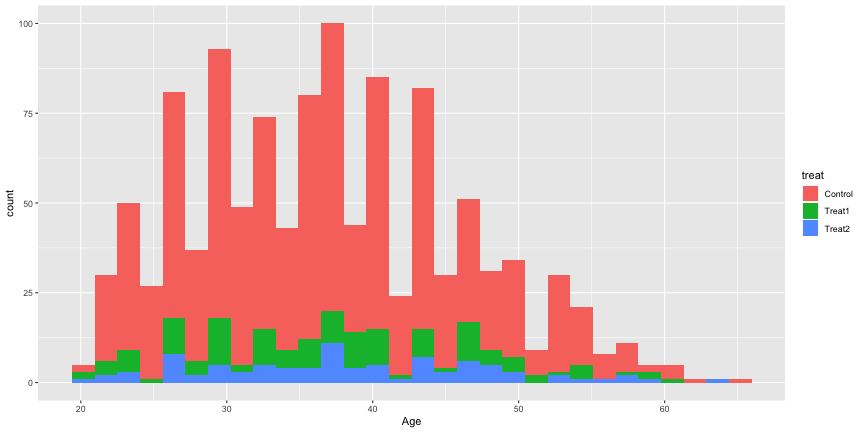<!-- --> --- # Density Plot -- ```r ggplot(tutoring, aes(x = Age)) + geom_density() ``` 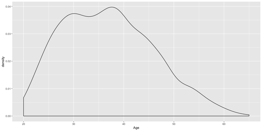<!-- --> --- # Density (add in qualitative variable) -- ```r ggplot(tutoring, aes(x = Age, color = treat)) + geom_density() ``` 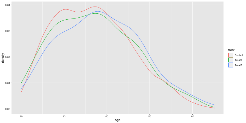<!-- --> --- # Density (using facets) -- ```r ggplot(tutoring, aes(x = Age, fill = treat)) + geom_density() + facet_wrap(~ treat, ncol = 1) ``` 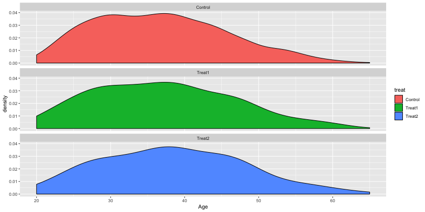<!-- --> --- # Bar Plot -- ```r ggplot(tutoring, aes(x = Course)) + geom_bar() ``` 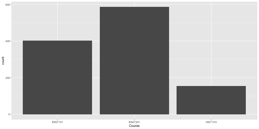<!-- --> --- # Bar Plot (with treatment) -- ```r ggplot(tutoring, aes(x = Course, fill = treat)) + geom_bar() ``` 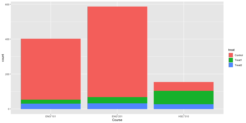<!-- --> --- # Bar Plot (with treatment, dodging) -- ```r ggplot(tutoring, aes(x = Course, fill = treat)) + geom_bar(position = 'dodge') ``` 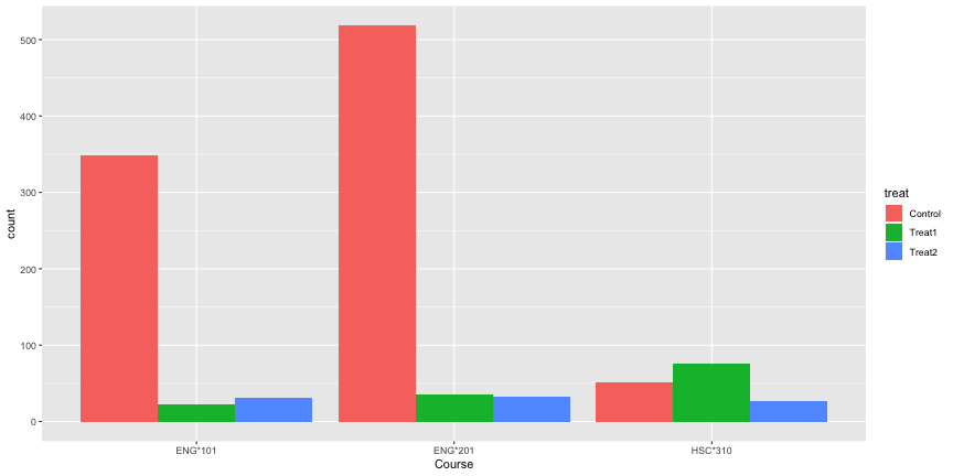<!-- --> --- # Boxplots -- ```r ggplot(tutoring, aes(x = treat, y = GPA)) + geom_boxplot() ``` 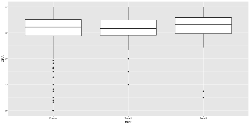<!-- --> --- # Boxplots (with means) -- ```r tab <- describeBy(tutoring$GPA, tutoring$treat, mat = TRUE) ggplot(tutoring, aes(x = treat, y = GPA)) + geom_boxplot() + geom_point(data = tab, aes(x = group1, y = mean), color = 'green', size = 4) ``` 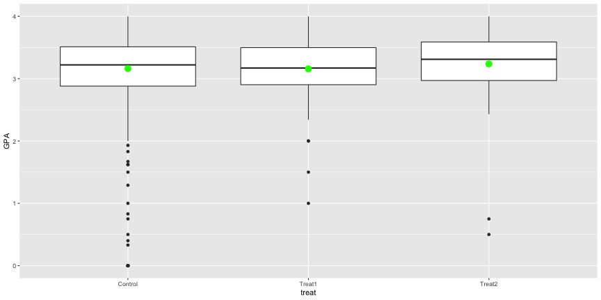<!-- --> --- # Violon Plots -- ```r ggplot(tutoring, aes(x = treat, y = GPA)) + geom_violin() ``` 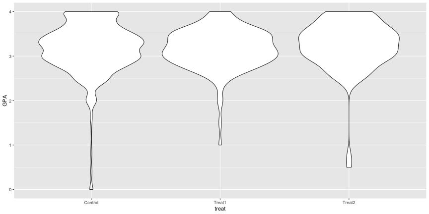<!-- --> --- # Scatterplots Age vs GPA -- ```r ggplot(tutoring, aes(x = Age, y = GPA)) + geom_point() ``` 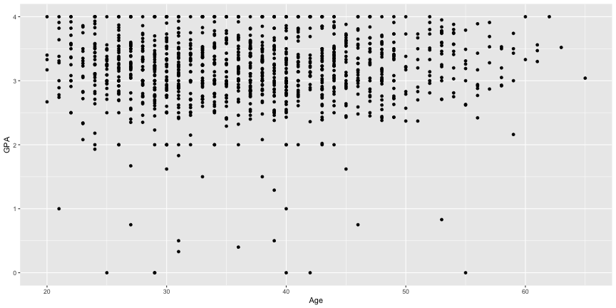<!-- --> --- # Scatterplots (add Gender) ```r ggplot(tutoring, aes(x = Age, y = GPA, color = Gender)) + geom_point() ``` 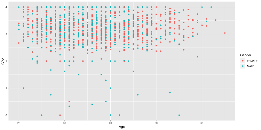<!-- --> --- # Summarizing null hypothesis tests -- ```r tab <- describeBy(tutoring$Grade, tutoring$treat, mat = TRUE, skew = FALSE) tab ``` ``` ## item group1 vars n mean sd min max range se ## X11 1 Control 1 918 2.790850 1.5425068 0 4 4 0.05091031 ## X12 2 Treat1 1 134 3.179104 1.0026337 0 4 4 0.08661436 ## X13 3 Treat2 1 90 3.488889 0.8244091 0 4 4 0.08690035 ``` --- # Summarizing null hypothesis tests (cont.) -- ```r ggplot(tab, aes(x = group1, y = mean)) + geom_errorbar(aes(ymin = mean - (1.96*se), ymax = mean + (1.96* se))) + geom_point(size = 3, color = 'blue') ``` <!-- --> --- # Gapminder  --- # Getting Started Download the data (right click so save file as) * [Countries](https://github.com/jbryer/EPSY887-Fall2019/blob/master/datasets/gapminder/Data%20Geographies%20-%20v1%20-%20by%20Gapminder.xlsx?raw=true) * [Life Expectancy](https://github.com/jbryer/EPSY887-Fall2019/blob/master/datasets/gapminder/lex-by-gapminder.xlsx?raw=true) * [Population](https://github.com/jbryer/EPSY887-Fall2019/blob/master/datasets/gapminder/Data%20Population%20-%20v5%20-%201800%20to%202100%20World%20Regions%20and%20Countries%20by%20Gapminder.xlsx?raw=true) * [Income](https://github.com/jbryer/EPSY887-Fall2019/blob/master/datasets/gapminder/gdppc_cppp-by-gapminder.xlsx?raw=true) Read the data into R ```r countries <- read_xlsx('../datasets/gapminder/Data Geographies - v1 - by Gapminder.xlsx', sheet = 2) life_expectancy <- read_xlsx('../datasets/gapminder/lex-by-gapminder.xlsx', sheet = 2) population <- read_xlsx('../datasets/gapminder/Data Population - v5 - 1800 to 2100 World Regions and Countries by Gapminder.xlsx', sheet = 'data-countries-etc-by-year-colu') income <- read_xlsx('../datasets/gapminder/gdppc_cppp-by-gapminder.xlsx', sheet = 2) ``` --- # Data Preparation Because life_expectancy and income have overlapping column names, we need to rename them so we can identify the columns in the merged dataset ```r names(life_expectancy)[5:ncol(life_expectancy)] <- paste0('le_', names(life_expectancy)[5:ncol(life_expectancy)]) names(income)[5:ncol(income)] <- paste0('income_', names(income)[5:ncol(income)]) names(population)[4:ncol(population)] <- as.character(as.integer( names(population)[4:ncol(population)])) names(population)[4:ncol(population)] <- paste0('pop_', names(population)[4:ncol(population)]) ``` --- # Merge Tables ```r gapminder <- merge(countries, life_expectancy, by = 'geo', all.x = TRUE) gapminder <- merge(gapminder, income, by = 'geo', all.x = TRUE) gapminder <- merge(gapminder, population, by = 'geo', all.x = TRUE) nrow(gapminder) ``` ``` ## [1] 197 ``` ```r ncol(gapminder) ``` ``` ## [1] 863 ``` --- # Subset the data.frame We'll create a variable for the year we want to look at. As we will see later, we can change this variable and create the figure for a different year quickly. ```r year <- '2017' ``` Subset the gapminder data.frame to include only the columns we are interested in. ```r gapminder2 <- gapminder %>% rename(name = name.x) %>% select(geo, name, four_regions, paste0('income_', year), paste0('pop_', year), paste0('le_', year)) %>% rename(income = paste0('income_', year), population = paste0('pop_', year), life_expectancy = paste0('le_', year)) ``` --- # Income Levels ```r income_levels <- c(2 * 356, 8 * 356, 32 * 356) income_levels_df <- data.frame( position = c(0, income_levels), label = c('Level 1', 'Level 2', 'Level 3', 'Level 4') ) ``` > Level 1 is people who earn less than $2 a day and live in extreme poverty. Most people live on Level 2, where they earn between $2 and $8 a day. On Level 3, people earn between $8 and $32. The richest billion people live on Level 4, where their income is more than $32 a day (an easy way to remember the threshold for each level is by multiplying the previous number by four, so 2 – 8 – 32).<sup>1</sup> <sup>1</sup> See https://www.gapminder.org/topics/four-income-levels/ for more information. --- # Gapminder in ggplot2 <!-- --> --- # The ggplot2 expression ```r ggplot(gapminder2, aes(x = income, y = life_expectancy, size = population, color = four_regions)) + geom_vline(xintercept = income_levels, alpha = 0.5) + geom_text(data = income_levels_df, aes(x = position, label = label), color = 'black', size = 3, y = 50, hjust = -0.1) + geom_point() + scale_x_log10(labels = function(x) {prettyNum(x, big.mark=',', scientific=F)}) + scale_color_brewer('Region', type = 'qual', palette = 6) + xlab('Income (GDP per capita, log transformed)') + ylab('Life Expectancy (in years)') + ggtitle('World Health Chart 2017', subtitle = 'Data Source: Gapminder') + theme_minimal() ```